tl;dr
Across 19 years of Reddit comments, the rise in em dash usage tracks the normalization of AI assisted writing, where polished, clause heavy sentence structure increasingly replaces older, choppier human styles.
Check out the demo: Em Dash Observer
The Journey (Technical)
Saw this post on hackernews.
Em Dash in Reddit Comments (jonatron.github.io)
At the time it has 3 comments.
"Hopefully someone else can use the CSV to make a graph that isn't terrible"
jonatron the OP, 48 minutes ago
Well jonatron, I will!
Also, amazing handle.
Data Processing
Current Data Format
day (as unix timestamp / 86400), dash/emdash/count/both, count
Example Snippet:
13135,count,34
13139,dash,10
13143,dash,31
13147,count,102
13148,count,81
13129,dash,12
13140,dash,24
Data Target Format
- Sort by day
- Group by day for d3 visualizations
- Calculate metrics (em dash rates, etc.)
- Output optimized JSON format
It's Python time!
- injest the raw CSV
- groups all dash-related counts by day
- sorts the days
- computes per-day metrics like dash rates
- converts days into real dates
- write out both a sorted CSV and a JSON dataset
- print overall summary stats and trend comparisons across the dataset
Annnnd...done. Probably.
Data looks like this now:
{
  "data": [
    {
      "day": 13129,
      "date": "2005-12-12",
      "count": 76,
      "dash": 12,
      "emdash": 0,
      "both": 0,
      "emdashRate": 0.0,
      "dashRate": 15.7895,
      "bothRate": 0.0,
      "anyDashRate": 15.7895
    },
  ]
}Making it a Website
Setup project with the following:
- Next.js 16 - React framework with static export
- TypeScript - Type-safe development
- Tailwind CSS 4 - Modern utility-first styling
- D3.js 7 - Interactive data visualization
- Python 3 - Data processing pipeline
UI elements looking pretty '99, let's try out HeadlessUI...
And that was a big waste of time!
Thoughts on Tailwind CSS + HeadlessUI
The shadcn + Tailwind + Radix primitives turns basic UI building into a maze of unnecessary abstraction and ceremony.
I wanted a styled component library and what I got was:
- a design system skeleton
- 40 layers of indirection
- low-level primitives that weren’t meant to be seen
- CSS variables you have to maintain
- at-rules that VSCode doesn’t recognize
- configuration scattered across
globals.css,tailwind.config.ts, and Radix wrappers
You wanted a switch?
shadcn gives you:
<SwitchPrimitives.Root> - what the hell even is this
<SwitchPrimitives.Thumb> - a switch...THUMB?! what.- 40 Tailwind classes
- CSS variables for colors
- dark mode variants
- data-state attributes for animation
- a wrapper ref-forwarding function
- every customizable part exposed whether you need it or not
And I'm left scratching my bald head:
"Why do I need six files and three systems to render a toggle?"
I'm not trying to engineer a switch. I want to use a switch.
/rant
Pivot Time: Material UI
Instead of being frustrated (I'm not anymore!).
Switching to a known library that looks nice and is less untamed (thanks Google).
Annnnd we have something to post on the thread!
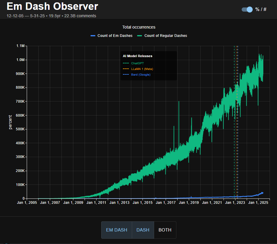
Jonatron responds!

And the fire is re-lit!
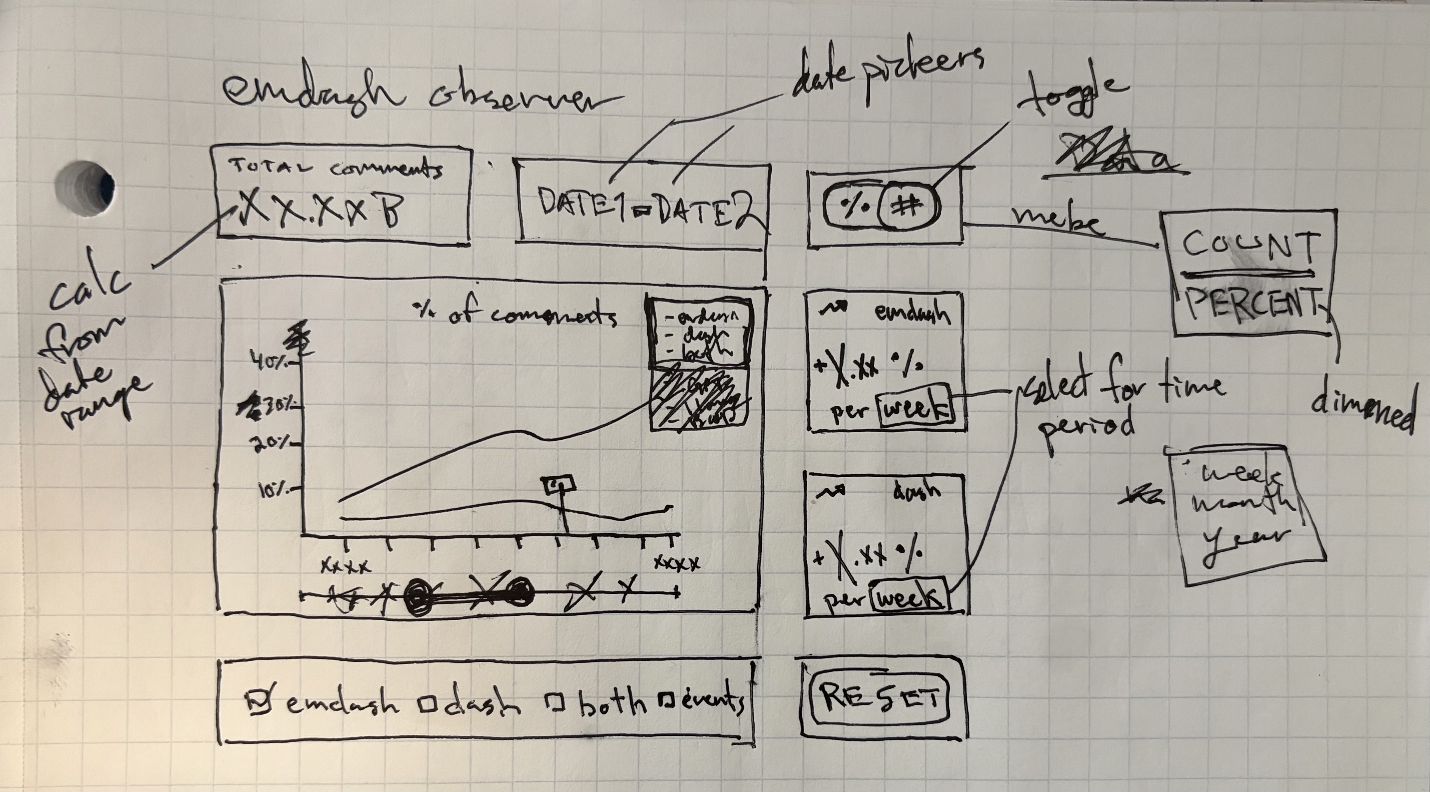
Let's make this nice for real.
Layout Sketch:
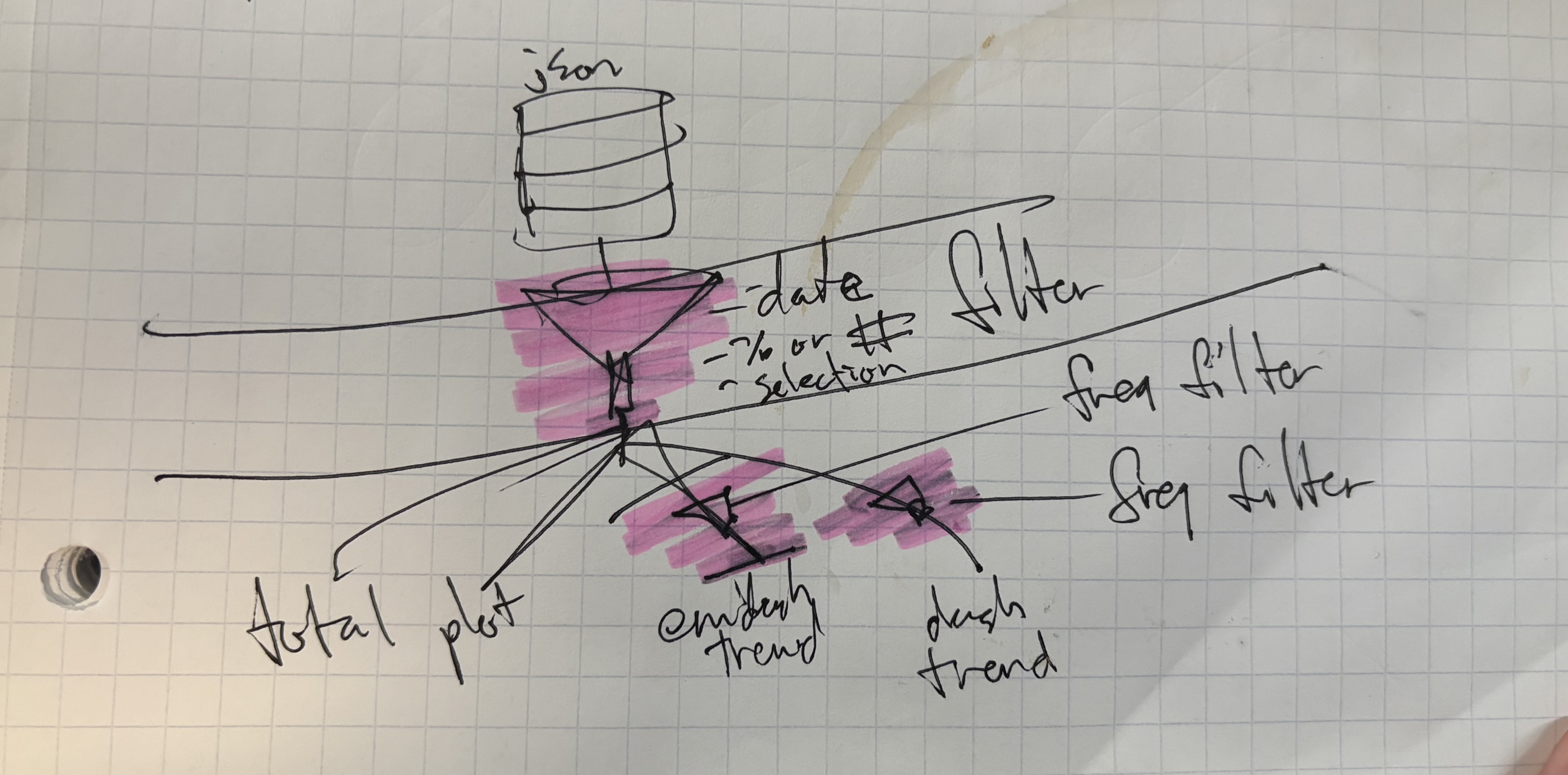
Data Filtering:
Material(izing) the design
Annnnnnnd...Material UI Charts is a scam.
Yep. I said it.
This is on the Overview Page that I based my sketch on.
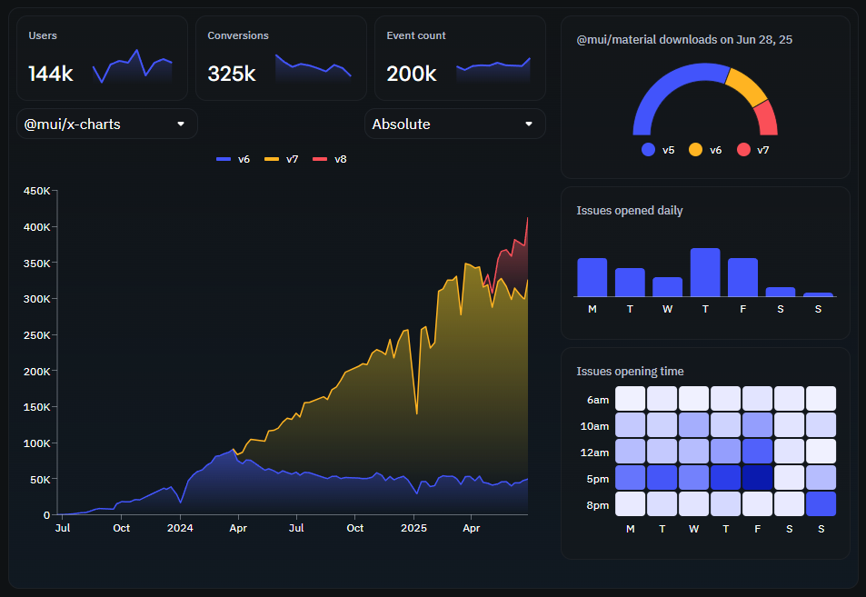
But...too bad. Example code for this doesn't actually exist.
The entire concept (as it seems to me) is to pull you in with the most basic looking charts and put generic features like setting a time range or zoom behind a paywall. A subscription paywall...yikes.

Despicable.
Here's the last pass before the pivot:
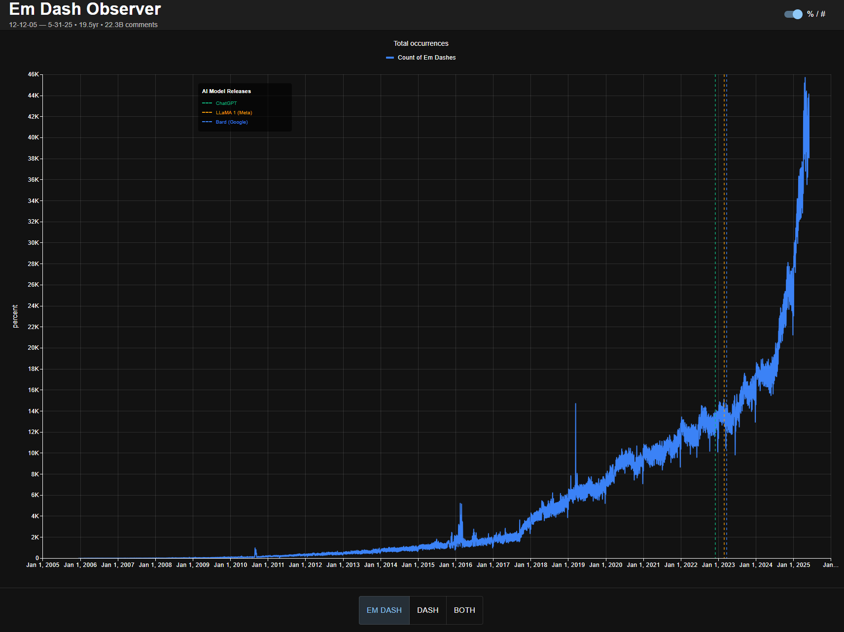
While awaiting the growing frustration to completely rip Material out of my stack I will simple replace the chart with...
Recharts!
Nice! Fun. Easy. I think there's a few too many data points (it lags) but I am much happier with the result.
Plus I didn't have to pay the GoogleGods any $.
More to come, maybe.
Post on hackernews: Em Dash in Reddit Comments, Interactive